Measuring Platform Success: Metrics That Matter


Table of Contents
How do you prove an internal platform creates value? Product teams measure revenue or user growth. Platform teams serve internal customers and enable outcomes rather than producing them directly. This creates a measurement gap — platform work is easy to fund when it’s novel and hard to justify when it’s mature.
I’ve watched this play out. A platform team builds an internal developer portal with self-service infrastructure provisioning. Six months in, leadership asks for success metrics. The team reports: 500 developers onboarded, 10,000 API calls per month, 99.9% uptime. Leadership responds: “That’s nice, but did we save money? Are developers faster?” The team can’t answer because they measured what the platform does, not what it enables.
The pivot is simple but fundamental: friction-focused metrics. Time to first deployment dropped from 2 weeks to 2 hours. Infrastructure tickets per developer dropped 80%. Developer NPS rose from -20 to +45. Now the narrative is clear: “Developers are 10x faster to get started and need 80% less support.” That story justifies continued investment.
The most common platform metrics mistake: measuring platform activity (requests served, uptime) instead of developer outcomes (time saved, friction reduced). A platform can be highly available and completely useless.
Meaningful platform metrics answer one question: is the platform making developers more productive? How long do common tasks take? How often do developers need help? How much cognitive load does the platform impose? Vanity metrics — adoption counts, API calls, uptime percentages — look impressive in slide decks but don’t demonstrate value.
Let’s look at the metrics that actually demonstrate platform value.
Core Platform Metrics
Lead Time Metrics
Lead time metrics measure how long things take. They’re the clearest indicators of platform friction because they directly answer “how fast can developers move?”
- Time to first deploymentThe single most revealing onboarding metric. Measure from a developer's start date (HR system) to their first production deployment (deployment system). This captures everything: account provisioning, access requests, documentation quality, tooling complexity. If it takes two weeks, something is broken. If it's under a day, your platform is doing its job.
- Time to new serviceMeasures self-service effectiveness. From service creation request (portal or ticket) to first successful health check in production — how much of this is automated versus waiting on humans? Anything over a week suggests manual provisioning steps. Under an hour means your automation is mature.
- Deployment lead timeTracks CI/CD efficiency: from code commit to running in production. This exposes approval bottlenecks, slow builds, and deployment friction. Elite teams hit under 15 minutes; struggling teams measure in days.
- Time to new environmentMeasures infrastructure automation maturity. From environment request to a fully functional environment passing smoke tests — this is pure platform capability. If developers wait days for a staging environment, your Terraform modules or Crossplane claims need work.
| Metric | Poor | Acceptable | Excellent |
|---|---|---|---|
| Time to first deployment | > 2 weeks | 1-5 days | < 1 day |
| Time to new service | > 1 week | 1-24 hours | < 1 hour |
| Time to new environment | > 3 days | 1-4 hours | < 15 minutes |
| Deployment lead time | > 1 day | 1-4 hours | < 15 minutes |
These metrics align with DORA‘s1 research-backed framework, which identified deployment frequency, lead time for changes, change failure rate, and time to restore service as the four key predictors of software delivery performance. DORA‘s annual State of DevOps reports consistently show that elite performers deploy multiple times per day with lead times under an hour — putting concrete numbers behind what “good” looks like at each maturity level.
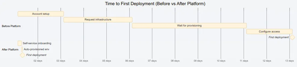
Lead time improvement visualization — 12 days reduced to 5 hours.description
Gantt chart titled Time to First Deployment Before versus After Platform. The chart compares two timelines. In the Before Platform section, Account setup takes 2 days, Request infrastructure takes 3 more days, Wait for provisioning takes 5 days, Configure access takes 2 days, and then First deployment appears as a milestone, for a total of roughly 12 days. In the After Platform section, Self-service onboarding takes 4 hours, Auto-provisioned environment takes 1 more hour, and then First deployment appears as a milestone, for a total of roughly 5 hours. The diagram shows how platform automation compresses a multi-day onboarding and provisioning sequence into a same-day self-service path.
Developer Friction Metrics
Lead time tells you how long. Friction metrics tell you how hard. They measure the cognitive and operational burden the platform imposes.
- Ticket volume per developerThe baseline friction indicator. More than 2 tickets per developer per month means developers are stuck regularly. Under 0.5 means the platform is largely self-service. But raw numbers don't tell the whole story — segment by ticket type. "How do I" tickets indicate documentation gaps. "Access request" tickets indicate poor provisioning automation. "It's broken" tickets indicate reliability problems.
- Self-service rateMeasures what percentage of common tasks developers complete without human intervention. Track portal/API completions against tickets for the same task types. If developers can provision an environment through the portal but 40% still file tickets, something's wrong with the self-service experience.
- Cognitive loadHarder to quantify but equally important. Count the config files developers must understand to deploy a service, the distinct tools in the deployment path, the context switches between systems for a single workflow. A platform that requires understanding 15 config files across 8 tools isn't self-service — it's a maze. For example: Kubernetes manifests, Helm values, Terraform variables, CI workflow configs, secrets references, Dockerfile, and monitoring configs — each requiring different syntax and mental models. If deploying a simple service touches more than 5 files, look for ways to consolidate or abstract.
| # | Metric | What It Indicates | Data Source |
|---|---|---|---|
| 1 | Tickets/developer/month | Support burden | Ticketing system |
| 2 | Self-service rate | Automation effectiveness | Portal analytics |
| 3 | Time to first deploy | Onboarding friction | HR + Deployment logs |
| 4 | Failed deployments | Platform reliability | CI/CD system |
| 5 | Rollback frequency | Change confidence | Deployment system |
Ticket volume is a lagging indicator — it tells you friction exists but not why. Combine with ticket categorization to identify which platform areas cause the most pain. “Access request” tickets indicate poor provisioning; “how do I” tickets indicate poor documentation.
Measurement Implementation
Data Collection Architecture
Platform metrics come from multiple systems that don’t naturally talk to each other. You need data from deployment systems (ArgoCD, GitHub Actions), ticketing systems (Jira, ServiceNow), your platform portal, and HR systems for onboarding metrics. The challenge is getting these into a unified view.
The collection pattern that works: event-driven ingestion into a stream (Kafka or Kinesis), enrichment with team and service metadata, aggregation into time-series storage, and visualization through dashboards. Raw events go to a data lake for historical analysis; aggregated metrics go to a time-series database for dashboards.
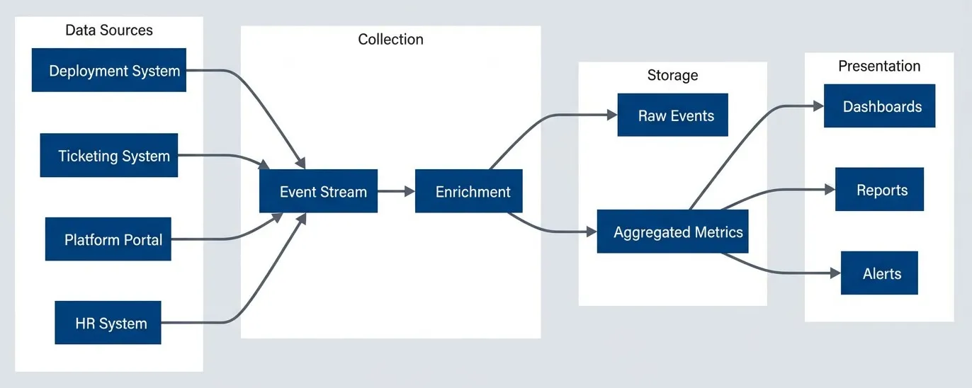
Metrics data flow from source systems to dashboards.description
Top-to-bottom flowchart with four grouped stages: Data Sources, Collection, Storage, and Presentation. The Data Sources group contains Deployment System, Ticketing System, Platform Portal, and HR System. All four sources feed into an Event Stream in the Collection group, which then feeds into Enrichment. From Enrichment, data flows to two storage targets: Raw Events and Aggregated Metrics. Aggregated Metrics then feed three presentation outputs: Dashboards, Reports, and Alerts. The diagram shows a metrics pipeline where operational and business events are collected from multiple systems, enriched with metadata, stored in both raw and summarized forms, and then exposed for visualization, reporting, and alerting.
For deployment events, capture the service name, team, environment, duration, and commit SHA. For tickets, capture category, requester team, resolution time, and first response time. For portal events, capture user, team, duration, and success/failure. The key is consistent metadata across sources so you can correlate — linking a developer’s first deployment to their HR start date, for example.
Metric Calculation Examples
The calculations themselves are straightforward once you have the data. These functions typically run as scheduled jobs (AWS Lambda, Kubernetes CronJobs) that query your data warehouse nightly and write results to a time-series database. Grafana or similar dashboards then query the aggregated results.
# Platform metric calculations
# Query deployment events from BigQuery/Snowflake, write results to InfluxDB/TimescaleDB

from datetime import datetime, timedelta
from dataclasses import dataclass
from typing import Optional
import pandas as pd

@dataclass
class DeploymentEvent:
    service: str
    team: str
    environment: str
    commit_sha: str
    commit_timestamp: datetime
    deploy_started: datetime
    deploy_completed: Optional[datetime]
    status: str  # success, failed, rolled_back


def calculate_lead_time(events: list[DeploymentEvent]) -> dict:
    """Calculate deployment lead time metrics."""
    successful = [e for e in events if e.status == 'success' and e.deploy_completed]
    lead_times = [
        (e.deploy_completed - e.commit_timestamp).total_seconds() / 3600
        for e in successful
    ]
    return {
        'median_hours': pd.Series(lead_times).median(),
        'p90_hours': pd.Series(lead_times).quantile(0.90),
        'count': len(successful),
    }


def calculate_change_failure_rate(events: list[DeploymentEvent]) -> dict:
    """Calculate change failure rate."""
    total = len(events)
    failed = len([e for e in events if e.status in ('failed', 'rolled_back')])
    return {
        'failure_rate': failed / total if total > 0 else 0,
        'total_deployments': total,
        'failures': failed,
}For onboarding metrics, you need to join HR data with deployment data. This calculation is trickier because HR systems and deployment systems rarely share identifiers — you’ll need a mapping table or identity service to correlate employee IDs with Git/deployment usernames:
@dataclass
class DeveloperOnboarding:
    employee_id: str
    start_date: datetime
    first_commit: Optional[datetime]
    first_prod_deploy: Optional[datetime]


def calculate_onboarding_metrics(onboardings: list[DeveloperOnboarding]) -> dict:
    """Calculate time to first deployment."""
    completed = [o for o in onboardings if o.first_prod_deploy]
    times_to_deploy = [
        (o.first_prod_deploy - o.start_date).days
        for o in completed
    ]
    return {
        'median_days': pd.Series(times_to_deploy).median() if times_to_deploy else None,
        'p90_days': pd.Series(times_to_deploy).quantile(0.90) if times_to_deploy else None,
        'completed_onboardings': len(completed),
        'pending_onboardings': len([o for o in onboardings if not o.first_prod_deploy]),
}Report median and P90 rather than averages. Averages hide outliers — a median of 2 hours with a P90 of 8 hours tells you most deployments are fast but some get stuck. That’s actionable information that an average would obscure.
Automate metric collection from the start. Manual metrics (surveys, spreadsheets) are valuable for qualitative insights but unsustainable for ongoing measurement. Build instrumentation into platform components.
Developer Experience Surveys
Automated metrics tell you what is happening. Surveys tell you why — and capture friction that doesn’t show up in logs.
Survey Design
Three survey types cover the developer lifecycle:
- Onboarding surveysGoes out 30 days after a developer's start date. Ask how long it took to make their first production deployment (validates your automated metric), what was most confusing, how they'd rate the documentation, and how many times they needed help. Free-text responses here are gold — new developers see problems that veterans have normalized.
- Quarterly pulse surveysTracks satisfaction trends. Keep them short: how easy is it to deploy to production? How easy is it to debug production issues? Does the platform make you more productive? What's your biggest obstacle? End with an NPS question: "How likely are you to recommend this platform to a colleague?" Track these over time — the trend matters more than any single score.
- Feature feedbackTriggers after someone uses a new capability. Did it solve your problem? How much time does it save per week? What would make it more useful? This validates whether your investments are paying off.
- Annual deep-divesLonger surveys (15 minutes) that explore broader themes: overall platform satisfaction, feature priorities, pain points that don't fit in pulse surveys. Run these yearly to inform roadmap planning.
| Survey Type | Frequency | Length | Response Goal |
|---|---|---|---|
| Onboarding | Once (30 days) | 5 min | > 80% |
| Quarterly pulse | Quarterly | 3 min | > 60% |
| Feature feedback | After use | 2 min | > 40% |
| Annual deep-dive | Yearly | 15 min | > 50% |
NPS (Net Promoter Score) deserves special attention. Scores 9-10 are promoters, 7-8 are passives, 0-6 are detractors. NPS = % Promoters - % Detractors. Above 50 is excellent for an internal platform; below 0 means you have serious problems. But the number alone doesn’t help — follow up with detractors to understand why.
Implementing NPS collection is straightforward. Most survey tools (Google Forms, Typeform, SurveyMonkey, Qualtrics) support the standard 0-10 scale question. For automation, trigger surveys via your HR system (onboarding) or platform events (feature usage). The calculation itself is simple — export responses to a spreadsheet or write a quick script:
# NPS calculation from survey responses
def calculate_nps(scores: list[int]) -> dict:
    """Calculate NPS from 0-10 survey responses."""
    if not scores:
        return {'nps': 0, 'promoters_pct': 0, 'detractors_pct': 0, 'responses': 0}

    promoters = len([s for s in scores if s >= 9])
    detractors = len([s for s in scores if s <= 6])
    total = len(scores)

    return {
        'nps': round(((promoters - detractors) / total) * 100),
        'promoters_pct': round((promoters / total) * 100),
        'detractors_pct': round((detractors / total) * 100),
        'responses': total,
}Qualitative Analysis
Free-text responses require manual analysis, but they’re worth the effort. Tag responses by theme: documentation gaps, slow performance, access issues, missing features, confusing UX. Count frequency. The themes that appear repeatedly are your roadmap priorities.
Combine survey feedback with other qualitative sources: support ticket themes, Slack channel sentiment2, office hours topics, team retrospective callouts. None of these alone tells the full story, but patterns across sources are signal.
Prioritize by impact and frequency. High-frequency, high-impact issues get fixed immediately. High-frequency, low-impact issues are quick wins. Low-frequency, high-impact issues go on the roadmap. Low-frequency, low-impact issues get monitored but not prioritized.
Survey fatigue is real. Keep surveys short, respect developer time, and — critically — act on feedback visibly. If developers don’t see changes from feedback, they stop providing it.
Avoiding Vanity Metrics
Some metrics exist primarily to impress stakeholders. They show activity without indicating impact — and they’re dangerously easy to optimize for while missing actual value.
Vanity vs Actionable Metrics
Here’s how common platform metrics break down:
| # | Vanity Metric | Why It's Misleading | Actionable Alternative |
|---|---|---|---|
| 1 | "500 developers use the platform" | Doesn't indicate if they're productive | Time to first deployment for new developers |
| 2 | "10 million API calls/month" | Could be inefficient polling or errors | Successful self-service completions |
| 3 | "99.99% uptime" | Available but unusable is still failure | Successful deployment rate, P99 latency |
| 4 | "1000 deployments this month" | Includes failures, rollbacks, test envs | Production deployment success rate |
| 5 | "500 documentation pages" | Quantity ≠ quality or findability | Search success rate, ticket deflection |
The test for a good metric: does it tell you what to do? “We have 1000 users” tells you nothing. “50% of users struggle with authentication” tells you to improve the auth flow. “Satisfaction is good” is useless. “NPS improved from 20 to 35 this quarter” shows progress and lets you dig into why.
Metric Pitfalls
- Goodhart's LawThe biggest trap: when a measure becomes a target, it ceases to be a good measure. Target ticket reduction and support becomes harder to access. Target deployment frequency and deployments get artificially split. Target NPS and only happy teams get surveyed. The antidote is measuring outcomes (developer productivity) rather than activities (ticket counts).
- Survivorship biasMeans only measuring successful cases. If you track deployment time only for successful deploys, you miss that failed deployments might indicate UX problems. If you survey only active platform users, you miss teams that left. Include failures in your metrics; run exit surveys when teams churn.
- Attribution errorsCredit the platform for unrelated improvements. "Lead time improved 50% after platform launch"—but the team also grew, hired senior engineers, and changed their process. Control for variables by comparing similar teams or tracking metrics that isolate platform impact.
- Sampling biasMeasures unrepresentative subsets. Feedback from teams in office hours comes from self-selected engaged users. Random sampling and broad surveys give you the full picture.
Establishing Baselines
You can’t show improvement without knowing your starting point. The most common mistake: launch a platform, then ask “how much did we improve?” Measure before changes, even if the measurement is imperfect. Document your methodology. Accept that baselines may be incomplete. Track consistently over time.
At minimum, establish baselines for: time to first deployment (new hires), ticket volume per developer, deployment frequency, and change failure rate. These four metrics tell you whether developers are getting productive faster and staying productive with less support.
Metrics without baselines are stories without beginnings. If you can’t say “before the platform, X took Y time,” you can’t prove the platform helped. Start measuring before you ship.
Dashboards and Reporting
Different audiences need different views of the same data. Executives want trends and ROI. Platform engineers want real-time operational metrics. Product teams want their own performance relative to others.
Dashboard Design
- Executive dashboardsShows 4-6 headline metrics with trends: developer NPS, time to first deployment, ticket volume per developer, deployment success rate. Update monthly. The goal is answering "Is the platform investment paying off?" without requiring deep dives.
- Platform team dashboardsOperational: deployment success rates by team and service, self-service completion rates, error rates by component, latency percentiles, active incidents. Update in real-time. These drive daily decisions about what to fix and where to invest.
- Team-specific viewsLets product teams see their own metrics: their deployment frequency, their lead time, their ticket count, their resource usage. Comparisons to org averages help teams self-identify whether they're outliers needing help.
For executive dashboards in Grafana, structure with headline stats at the top (single-stat panels showing current value vs. last quarter), trend lines in the middle (12-month time series for deployment frequency and change failure rate), and breakdowns at the bottom (bar charts for lead time by team, pie charts for ticket categories).
Alerting Thresholds
Dashboards show state; alerts drive action. Configure alerts for metrics that require immediate attention:
- Deployment success rateBelow 80% for 4+ hours — something is systematically broken
- Build queue timeExceeding 30 minutes — capacity or configuration problems
- Self-service completion rateDropping below baseline by 20%—recent changes broke something
- P0 ticketsOpened — immediate platform team attention needed
Resist the urge to alert on everything. Alert fatigue leads to ignored alerts. Reserve alerts for conditions that require action within hours, not trends that require analysis over weeks.
Reporting Cadence
Not everything belongs on a real-time dashboard. Structured reports at regular intervals provide narrative and context that dashboards can’t.
| # | Report | Audience | Frequency | Key Question |
|---|---|---|---|---|
| 1 | Weekly digest | Platform team | Weekly | "What happened this week?" |
| 2 | Monthly review | Eng leadership | Monthly | "Are we improving?" |
| 3 | Quarterly business review | Executives | Quarterly | "Is platform investment paying off?" |
| 4 | Annual report | Organization | Yearly | "What value did platform deliver?" |
- 1Weekly digestsGoes to the platform team via Slack or email. Automate these with Grafana's reporting plugin or a custom script. Include deployment count and success rate, median lead time, tickets opened and resolved, and any notable incidents. Keep it scannable — if it takes more than 30 seconds to read, it won't get read.
- 2Monthly reviewsGoes to engineering leadership. DORA metrics trends, developer satisfaction trends, major accomplishments, risks and blockers. This is where you add narrative: why did lead time spike in week 3? What's blocking the self-service rate improvement?
- 3Quarterly business reviewsGoes to executive stakeholders. Platform ROI analysis, developer productivity trends, roadmap progress, investment requests. Translate technical metrics into business impact: "Onboarding time reduction saved 200 developer-hours this quarter."
- 4Annual reportsGoes to the broader organization. Year in review, major milestones, impact stories, next year's vision. This is your chance to build organizational awareness and support for platform investment.
Automate reporting wherever possible. Manual reports are time-consuming and inconsistent. Use Grafana’s reporting plugin, scheduled Jupyter notebooks3, or custom scripts. Reserve manual effort for narrative and interpretation — the “why” behind the numbers.
Conclusion
Without metrics focused on developer friction, platforms can’t prove value, prioritize work, or demonstrate improvement. The right metrics answer one question: are developers more productive? Lead time, ticket deflection, self-service rates, and satisfaction scores provide that answer. Adoption counts and API calls do not.
If you’re starting from scratch, don’t try to build everything at once. Start with four baseline metrics you can measure today, even imperfectly: time to first deployment (ask new hires), tickets per developer (query your ticketing system), deployment frequency (check your CI logs), and a simple quarterly NPS survey. Instrument as you go, automate what you can, and add sophistication over time. A spreadsheet tracking the right metrics beats a sophisticated dashboard tracking the wrong ones.
Metrics are a means to an end. The goal isn’t impressive dashboards — it’s understanding whether the platform reduces friction and enabling decisions about where to invest next. If metrics don’t change behavior, they’re not worth collecting.
The ultimate goal is a clear narrative: “Before the platform, onboarding took two weeks. After, it takes two hours. We saved 200 developer-hours this quarter.” That story, backed by data, justifies continued investment and guides roadmap decisions.
Footnotes
-
DORA (DevOps Research and Assessment) is a research program that identified four key metrics predicting software delivery performance: deployment frequency, lead time for changes, change failure rate, and time to restore service. Their annual State of DevOps reports provide industry benchmarks. Elite performers deploy multiple times per day with lead times under an hour. If you’re measuring in weeks, you’re not just slow — you’re losing competitive ground.
↩ -
Slack sentiment can be measured several ways: third-party analytics apps like Flowtrace that integrate directly with Slack; custom bots that send messages to sentiment APIs (Google Cloud Natural Language, AWS Comprehend); data exports analyzed with Python NLP libraries; or simply tracking reaction emoji patterns (👍 vs ❓) to gauge resolution versus confusion.
↩ -
Automating reports with Jupyter notebooks requires three components: parameterization, headless execution, and scheduling. Use Papermill to inject values (like report dates) at runtime — tag cells with “parameters” in JupyterLab’s Property Inspector, then run
papermill input.ipynb output_report.ipynb -p report_date '2024-02-01'. For simpler cases without parameters,jupyter nbconvert --to html --execute my_report.ipynbgenerates HTML output directly. Schedule either command with cron, Airflow, or your CI system.↩
Sharethisarticle
Enjoyed the read? Share it with your network.